Hack-a-thon 2021
In the MSCI 599 class Marine Data Science with R taught by Dr. Erin Meyer-Gutbrod, students learn basic programming skills, version control and collaborative coding practices with git and GitHub, dynamic programming notebooks, data cleaning and visualization techniques, statistical tests and models, spatial analysis and mapping. These skills are learned by analyzing a wide range of data sets, including climate indices (global temperature, atmospheric CO2, and ice melt), seafloor bathymetry, ocean primary production from satellites, penguin anatomy, fisheries stock assessment, spatial management boundaries and AIS ship tracks. In addition to honing these skills, students are asked to analyze a dataset to address a societal problem in a week-long hack-a-thon. Potential topics are identified by students and the final topic is chosen through a class vote. The goal of this class exercise is to familiarize students with the practice of using scientific skills to address real world problems. The analysis is made public to raise awareness about critical societal problems and to showcase the excellent work that is done by graduate students and upper-level undergraduates at the University of South Carolina.
Note: The following analysis should be treated as a class exercise and not an analysis that has undergone rigorous review by field experts.
Note: The following analysis should be treated as a class exercise and not an analysis that has undergone rigorous review by field experts.
2021 Hack-a-thon theme: Food Scarcity in South Carolina
The Spring 2021 MSCI 599 class decided to analyze food scarcity data in South Carolina. The primary dataset come from the 2018 Map the Meal Gap study conducted by Feeding America: https://map.feedingamerica.org/county/2018/overall/south-carolina
Supplemental datasets were brought in from organizations such as the US Census Bureau, the Department of Education and the US Department of Agriculture. The resulting analysis assesses four key topics relevant to food security:
Website Contributors (listed alphabetically):
Hunter Beans, Maya Becker, Ana Bishop, Halley Carruthers, Brittany DeArmitt, Lauren Faulk, Sarah Humphrey, Heather Kish, Annie Klyce, Emily Lamm, Patrick Lawson, Nayan Mallick, Kristiaan Merritt, Maddie Petersen, Ekaterina Rojas-Kolomiets, Blake Stubbins, Archana Venkatachari, Holly Westbrook, Charles (Andy) Wykel, Sarah Zajovits
Supplemental datasets were brought in from organizations such as the US Census Bureau, the Department of Education and the US Department of Agriculture. The resulting analysis assesses four key topics relevant to food security:
- Child Food Insecurity and School Lunches
- Food Security and Minority Groups
- Food Security and County Industry Characteristics
- Gender and Child Food Insecurity Dynamics
Website Contributors (listed alphabetically):
Hunter Beans, Maya Becker, Ana Bishop, Halley Carruthers, Brittany DeArmitt, Lauren Faulk, Sarah Humphrey, Heather Kish, Annie Klyce, Emily Lamm, Patrick Lawson, Nayan Mallick, Kristiaan Merritt, Maddie Petersen, Ekaterina Rojas-Kolomiets, Blake Stubbins, Archana Venkatachari, Holly Westbrook, Charles (Andy) Wykel, Sarah Zajovits
Child food insecurity and school lunches
Child food insecurity and student free lunch eligibility by county (SC)
The bar plots below show by county the number of food insecure children (red) and the number of school students eligible for free lunch (blue) as percentages of the county population as a whole. The number of food insecure children can be interpreted as an indicator for the need of food assistance programs for kids. Free school lunches are a major example of these programs, and so by comparing these two datasets we can potentially highlight counties with a discrepancy between need and assistance provided. Both datasets are from the year 2018, the food insecurity data published by Feeding America and the school lunch eligibility data published by the Department of Education.
The bar plots below show by county the number of food insecure children (red) and the number of school students eligible for free lunch (blue) as percentages of the county population as a whole. The number of food insecure children can be interpreted as an indicator for the need of food assistance programs for kids. Free school lunches are a major example of these programs, and so by comparing these two datasets we can potentially highlight counties with a discrepancy between need and assistance provided. Both datasets are from the year 2018, the food insecurity data published by Feeding America and the school lunch eligibility data published by the Department of Education.
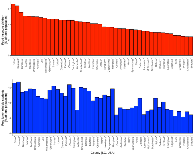
The data shows for one that for each county there are more free lunch eligible children than food insecure children. This disparity between the two may indicate that the criteria for free lunch eligibility is less extreme than food insecurity which is a good sign overall. However, there may be a difference in the sampling group of these two numbers that means they cannot be directly compared in terms of their absolute value. We cannot find in the metadata what the cutoff ages are for “children” in the food insecurity data and “students” in the Department of Education data. If the student age grouping is larger, this would lead to an overall larger number. We believe it is best to use these two values as more of metrics for the need of food assistance programs and the level of assistance provided by the schools as opposed to directly comparable measurements of the same population.
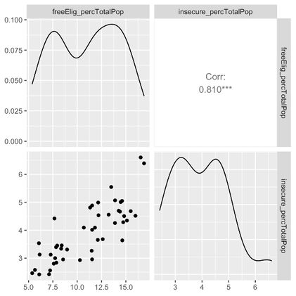
It is hard to tell from visually inspecting the bar plots, but we were curious about how correlated these two measurements are to each other as one would expect them to be well-correlated. The plot below shows this correlation, with a coefficient of 0.81 showing good correlation but with definite variation.
It is hard to tell from visually inspecting the bar plots, but we were curious about how correlated these two measurements are to each other as one would expect them to be well-correlated. The plot below shows this correlation, with a coefficient of 0.81 showing good correlation but with definite variation.
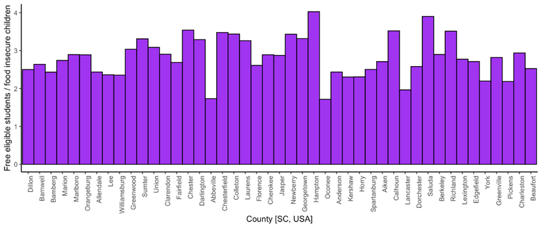
Building off of these ideas of comparing child food insecurity to free school lunch eligibility per county, the bar plot below shows the ratio of the number of free lunch eligible students to number of food insecure children. We consider this number as a proxy measurement for the discrepancy in assistance programs to need, with lower values indicating counties with less assistance provided relative to the need when compared to other counties. The three counties with the lowest number, or potentially the most discrepancy between assistance programs and need, are Abbeville, Oconee, and Lancaster.
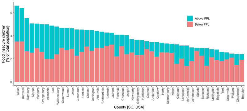
The Feeding America dataset also contained federal poverty line (FPL) statistics for the child population. We were curious whether the relative breakdown of food insecure children above and below the FPL was consistent across the counties. With significant percentages of food insecure children above the FPL, it is clear that food insecurity is not a problem restricted solely to those that fall below the FPL. Also, the relative percentages vary substantially, suggesting that the factors at play must be more complicated than simply related to poverty level.
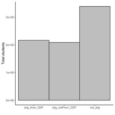
We downloaded and loaded school-by-school free meal statistics for public schools in SC in 2018. This dataset is provided by the SC Department of Education. We were initially interested in doing a similar comparison as the one done above between available meals and need, however it proved difficult to figure out a method for measuring need among schools individually. We instead chose to look at some simple questions about the Community Eligibility Provision program, (https://www.fns.usda.gov/cn/community-eligibility-provision) which allows for schools to provide meals to all students if a certain percentage of the student population has met the associated qualifications. We also took a general look at the various levels to which free meals are provided in schools to the students.
We created this barplot below to show the number of students eligible to receive free meals through CEP in comparison to the total number of students eligible to receive free meals not through CEP, and the number of students that aren’t eligible for free meals at all in schools in South Carolina.
We created this barplot below to show the number of students eligible to receive free meals through CEP in comparison to the total number of students eligible to receive free meals not through CEP, and the number of students that aren’t eligible for free meals at all in schools in South Carolina.
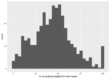
After we viewed the previous data, we were then curious to what level schools were providing students with free lunch eligibility outside of CEP. Below is a histogram showing the % of students in various schools in South Carolina that are free lunch eligible for schools without CEP. It is interesting to see how the full range is covered from no free lunches to full 100% eligibility within the schools.
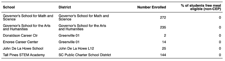
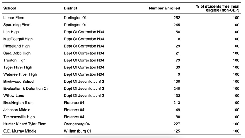
The tables below show the schools in South Carolina with the minimum and maximum % of students that are free meal eligible that don’t have CEP. The first table shows the 6 schools in South Carolina in which 0% of students are free meal eligible that don’t have CEP. The second table shows the 17 schools in South Carolina in which 100% of students are free meal eligible that don’t have CEP. Seeing these wide-ranging values in this histogram above prompted us to identify the schools with the most extreme values in the free meal eligibility. Which ones provide the most free lunch eligibility and which ones provide the least? We were surprised to find that 17 schools in South Carolina have 100% free meal eligibility that are not CEP. Most of these schools are a part of correctional facilities, and therefore probably receive meal funding from a different program. The schools that have zero free meal eligible children look like magnet schools. Certain SC magnet schools, such as the two Governor’s Schools in Columbia, SC, also operate on a different (non-CEP) program for meal financial assistance.
SC Food Scarcity and Minority Groups
This analysis examines connections between minority populations and food scarcity/insecurity in South Carolina. In order to learn more about the connection between race and areas of food scarcity, we plotted the percent of the population that identifies as a minority against the rate of food scarcity. This was done for each county within the state of South Carolina.
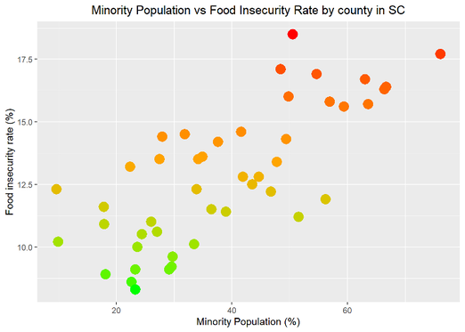
The scatter plot above shows that there is a strong trend between % minority and food security by county. The color of the data points represent the food insecurity rate. The red points indicate high food insecurity while the green points represent low food insecurity. There is a statistically significant correlation between % minority and food security by county (Pearson’s r = 0.74; p<0.001).
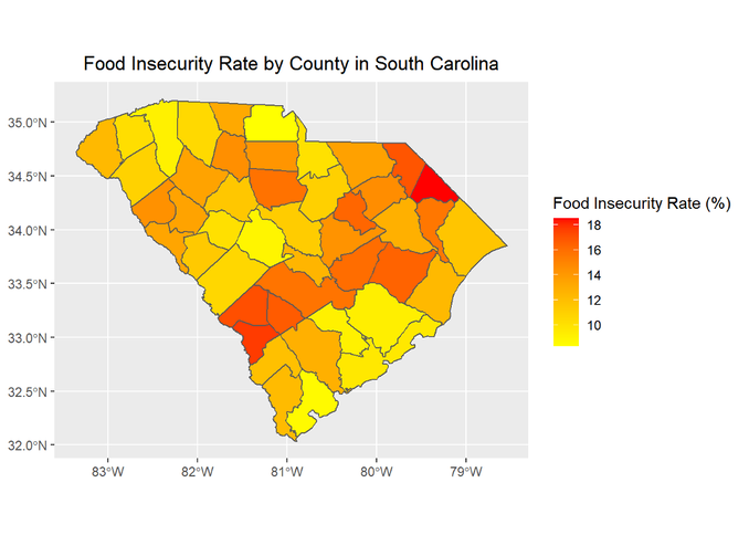
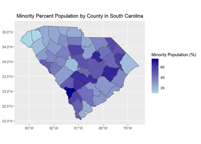
There is high spatial variability in food insecurity in South Carolina. These maps show the food insecurity rate in each SC county and the percent minority population in each SC county, respectively:
There is high spatial variability in food insecurity in South Carolina. These maps show the food insecurity rate in each SC county and the percent minority population in each SC county, respectively:
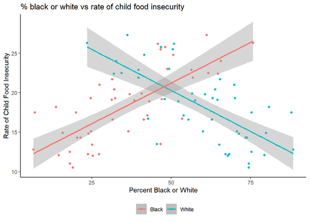
Next we examined the relationship between child food insecurity and minority populations by SC county.
Two linear models are displayed showing the relationship between percent of food insecure children and percent of White residents (blue) or percent of Black/African American residents (red). Counties with a higher percent Black/African American population have higher rates of food insecure children than predominantly White counties.
Two linear models are displayed showing the relationship between percent of food insecure children and percent of White residents (blue) or percent of Black/African American residents (red). Counties with a higher percent Black/African American population have higher rates of food insecure children than predominantly White counties.
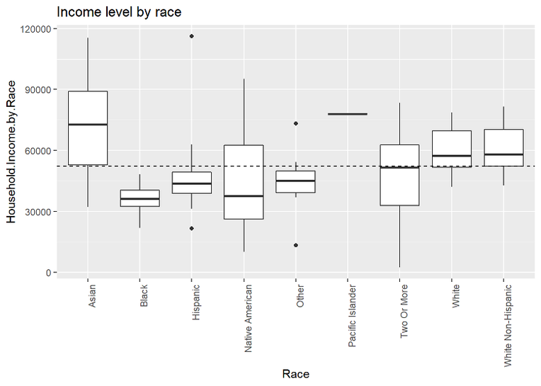
An exploration of median income by race provides some insight into the dynamics of food insecurity. Income data is collected from https://datausa.io/ .
South Carolina Food Insecurity vs. County Industry Characteristics
Introduction to the data:
Food insecurity in America has become a highly problematic issue now affecting tens of millions of American’s and children daily. With a lack of resources and financial stability, food accessibility declines exponentially. Food insecurity is closely correlated with poverty rates as constant access to sufficient nutrition becomes much more problematic with increasing poverty rates. We decided to combine food insecurity data with industry data in South Carolina that depicts different industry sizes, operation types, and number of employees by county. With this direct link of poverty rates to food insecure rates, analyzing South Carolina’s industry size data will greatly help our understanding of what factors are contributing to the food insecurity problem at the local level. We hypothesize that as industry size grows as a result of the number of employees rising, there will be a lower food insecurity rate for a county overall. Additional data from the industries in South Carolina can be found here: https://sccommerce.com/sc-industry-directory .
Method of analysis:
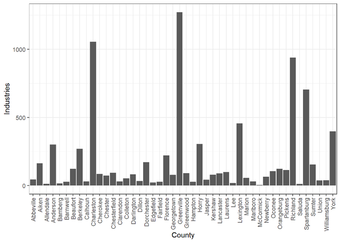
To start out, some data tidying and exploratory analyses were conducted by combining industry data to food insecurity rates by county in South Carolina. Next, industries were organized by type of operation and number of industries per county. To further analyze the business size or number of employees of each industry and how it relates to food insecurity levels, sizes of industries were categorized into categorical groups of small, small-medium, medium, medium-large, very-large. A model was then constructed and plotted depicting the food insecurity rates with the total industries per county to determine how well of a relationship exists between these variables. A second model was constructed to identify if there is any significant relationship between industry size and county. Graphs were then constructed to visualize the effect that industry total and industry size has on the food insecure rates for counties at the local level.
Food insecurity in America has become a highly problematic issue now affecting tens of millions of American’s and children daily. With a lack of resources and financial stability, food accessibility declines exponentially. Food insecurity is closely correlated with poverty rates as constant access to sufficient nutrition becomes much more problematic with increasing poverty rates. We decided to combine food insecurity data with industry data in South Carolina that depicts different industry sizes, operation types, and number of employees by county. With this direct link of poverty rates to food insecure rates, analyzing South Carolina’s industry size data will greatly help our understanding of what factors are contributing to the food insecurity problem at the local level. We hypothesize that as industry size grows as a result of the number of employees rising, there will be a lower food insecurity rate for a county overall. Additional data from the industries in South Carolina can be found here: https://sccommerce.com/sc-industry-directory .
Method of analysis:
To start out, some data tidying and exploratory analyses were conducted by combining industry data to food insecurity rates by county in South Carolina. Next, industries were organized by type of operation and number of industries per county. To further analyze the business size or number of employees of each industry and how it relates to food insecurity levels, sizes of industries were categorized into categorical groups of small, small-medium, medium, medium-large, very-large. A model was then constructed and plotted depicting the food insecurity rates with the total industries per county to determine how well of a relationship exists between these variables. A second model was constructed to identify if there is any significant relationship between industry size and county. Graphs were then constructed to visualize the effect that industry total and industry size has on the food insecure rates for counties at the local level.
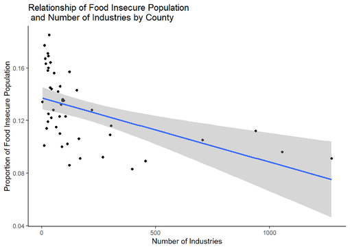
We built a linear model to quantify the relationship between the proportion of food insecure people in a county and the number of industries in that county. As the number of industries increases in a county there is a significant decline in food insecurity (p<0.001). This model has an adjusted R-squared of 0.233
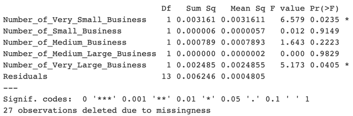
We conducted an Analysis of Variance (ANOVA) to determine how food insecurity by county changed with the total number of industries as well as the breakdown of number of industries in 5 industry size categories:
Discussion and Conclusions:
As expected, the proportion of the population that is food insecure decreased with the number of industries in a given county. The counties with more than 250 industries all tended to have a lower proportion of the population with food insecurity. While it would be difficult to make predictions about the proportion of food insecurity within a county for counties with few industries, all of the counties with 16% or more of the population with food insecurity had few industries registered.
Interestingly, the number of very small (defined as <50 employees) and very large industries (defined as > 500 employees) in a county were the metrics that significantly impacted the proportion of the county population with food insecurity (p<0.05). However, having a larger number of very small industries appears to be more impactful than having a few industries that hire hundreds of people. This suggests that policies should be structured to welcome both small and large industries to battle poverty.
Analysis of food insecurity rates among children and poverty among adult males and females in the state of South Carolina
Using a variety of data manipulations and methods, we aim to examine and visualize the food insecurity rates of children in South Carolina. To do this, we will use data from Feeding America (2018), and data containing individuals of different age groups living below the statewide poverty level in South Carolina.
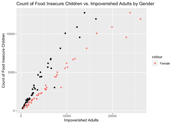
The scatter plot below shows the relationship between the number of female impoverished adults and child food insecurity rates, as well as the number male impoverished adults and child food insecurity rates per county in the state of South Carolina. Child food insecurity is tied to higher numbers of female poverty compared to male poverty in each county. There is a closer correlation between the number of impoverished females and child food insecurity (0.982) than that of male impoverished adults and child food insecurity (0.968). In the figure, lighter red points represent females, and the darker color represents males.
The scatter plot below shows the relationship between the number of female impoverished adults and child food insecurity rates, as well as the number male impoverished adults and child food insecurity rates per county in the state of South Carolina. Child food insecurity is tied to higher numbers of female poverty compared to male poverty in each county. There is a closer correlation between the number of impoverished females and child food insecurity (0.982) than that of male impoverished adults and child food insecurity (0.968). In the figure, lighter red points represent females, and the darker color represents males.
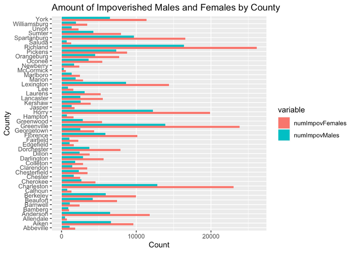
We also used a bar plot to show the amount of impoverished females vs. males by each county in South Carolina. The county with the highest number of both impoverished males and females is Richland county, whereas the county with the lowest number of impoverished males and females is McCormick county.
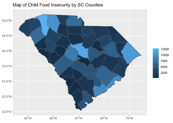
Spatial analysis allows us to visualize our data geographically across the state of South Carolina. Here, we are using county boundaries to aid in visualizing different child food insecurity rates in all counties in South Carolina. This figure shows a color scale gradient of the number of food-insecure children across all counties of South Carolina. The scale bar legend shows that lighter blue colors correspond with higher numbers of food-insecure children and darker blue colors correspond with lower numbers of food-insecure children. The most food-insecure children are in Richland County, which is the lightest blue hue seen on the map in the middle. The number of food-insecure children per county tracks the county population size, as may be expected.